THIS AND BEYOND
UX Design
SaaS
Dashboard
Design System


In Progress
This case study is currently being updated. Some sections and visuals are in progress but still show the overall design process and outcomes.
"theknot.com for after-life planning"
Beth Wright
Founder, This & Beyond
The opportunity
Planning after a loss is overwhelming. The experience shouldn't be.
Families often juggle legal paperwork, funeral planning, personal memories, and communication with loved ones—all while grieving. This & Beyond set out to create a single platform that makes these responsibilities feel more manageable without adding emotional burden.

The challenge
The platform wasn't one product, but several connected experiences.
Unlike a typical dashboard, This & Beyond needed to support multiple user types with very different goals. I designed a connected ecosystem that included:
Planning Dashboard
Mourner Dashboard
Memorial Website Builder
Family Invitations
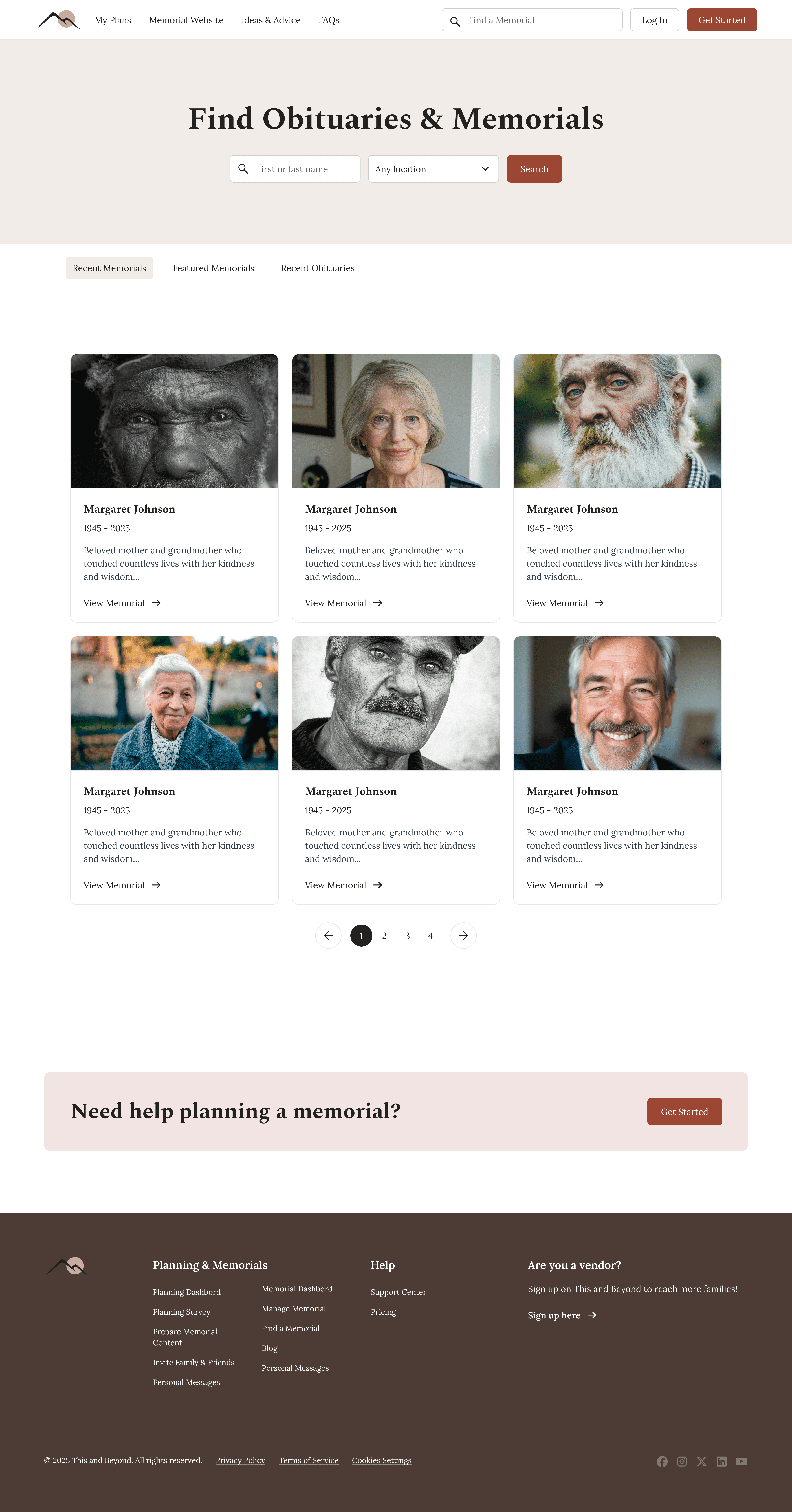
Public Memorial Microsite
Every experience needed to feel consistent while serving a different stage of the journey.

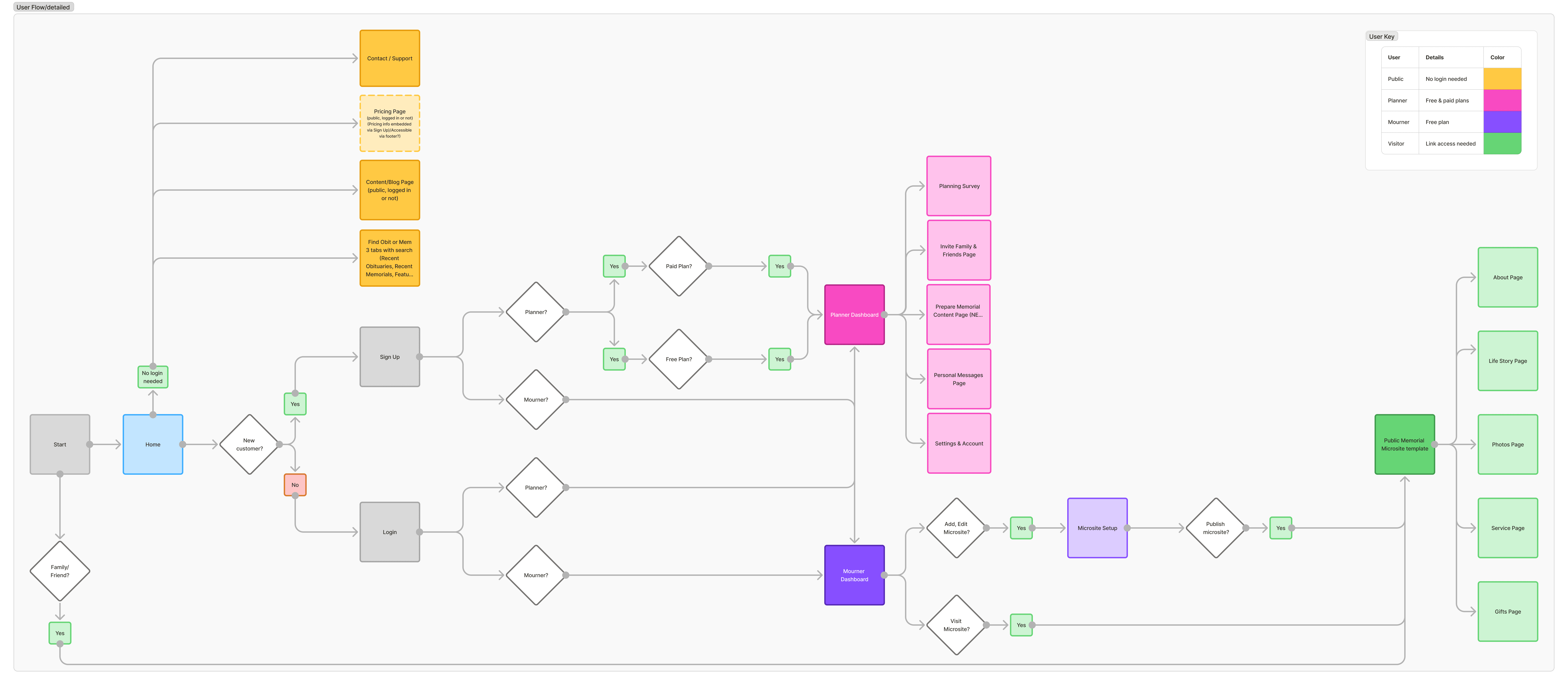
User flow: detailing how information is shared from Planner User to the Mourner User and then to the Public
Focused Area: Dashboards & Editors
I focused most of my effort on the internal dashboards and editors, where users needed clarity, guidance, and confidence while working through emotionally heavy tasks.
Planning Dashboard
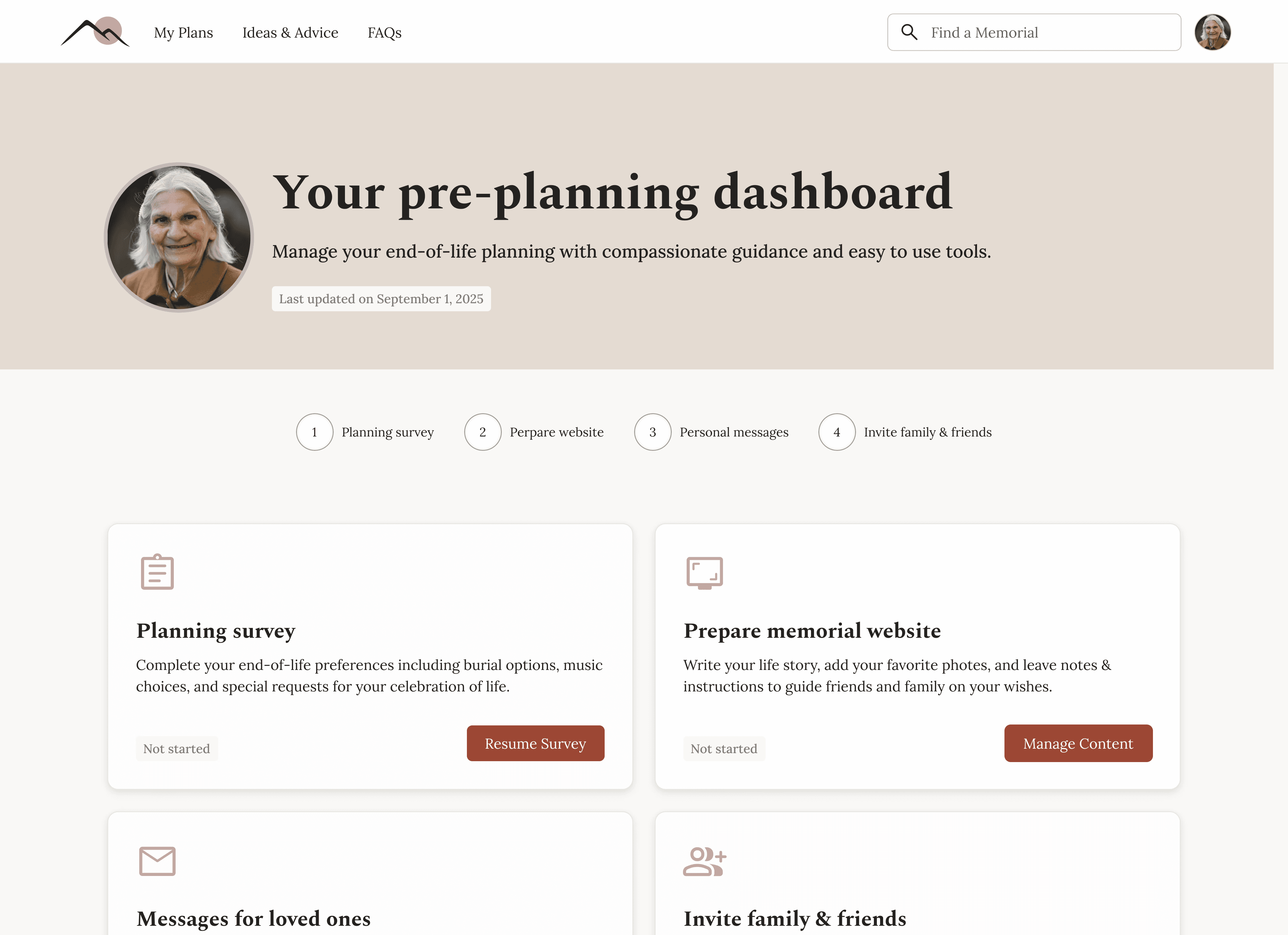
Planning Survey
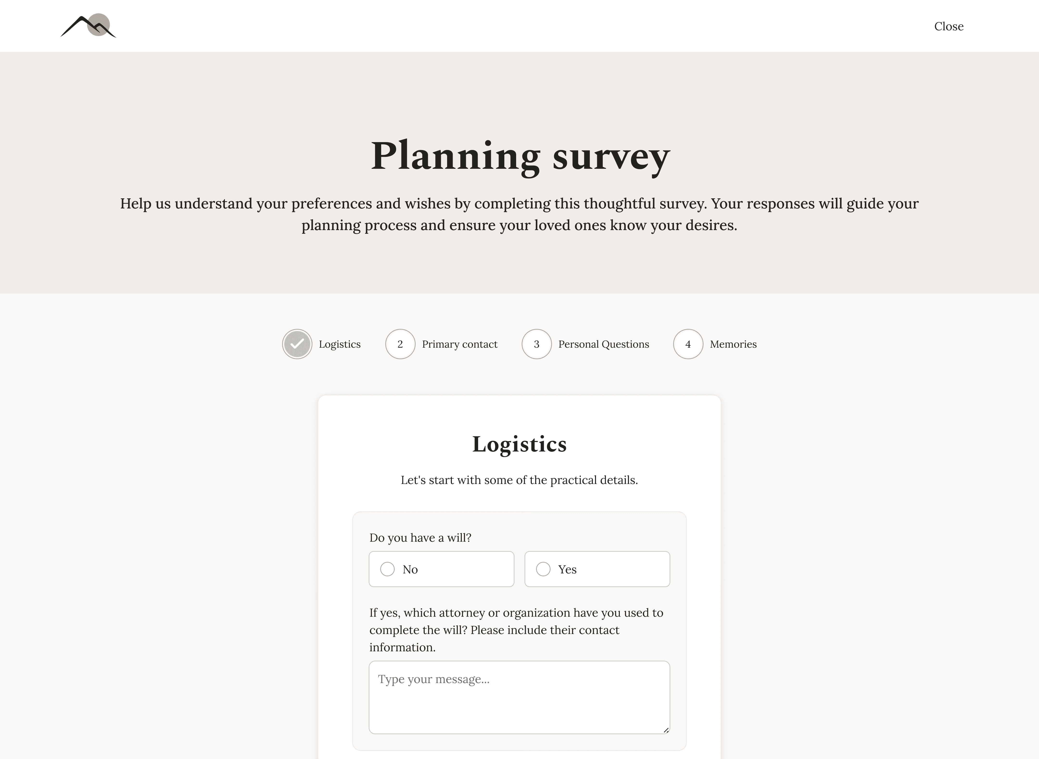
Planning Survey
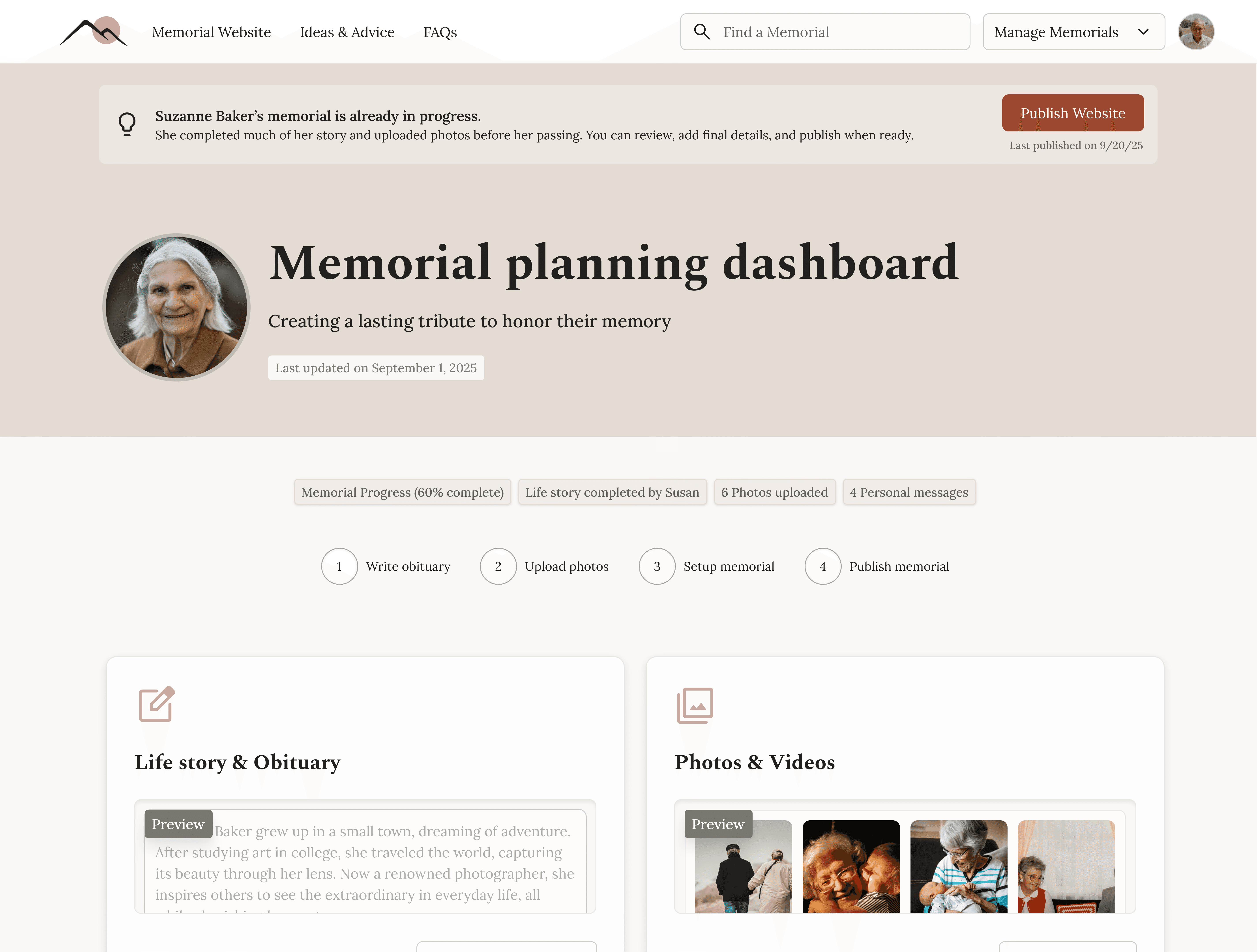
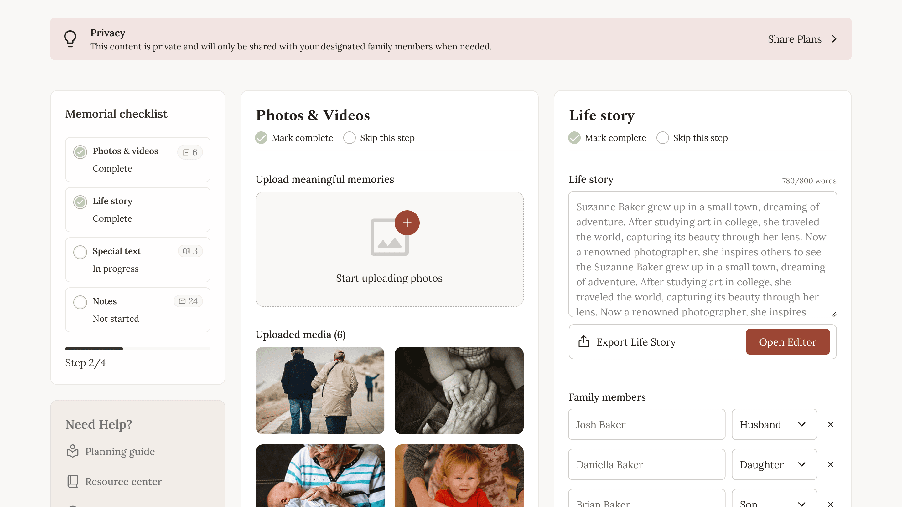
Memorial Microsite Editor
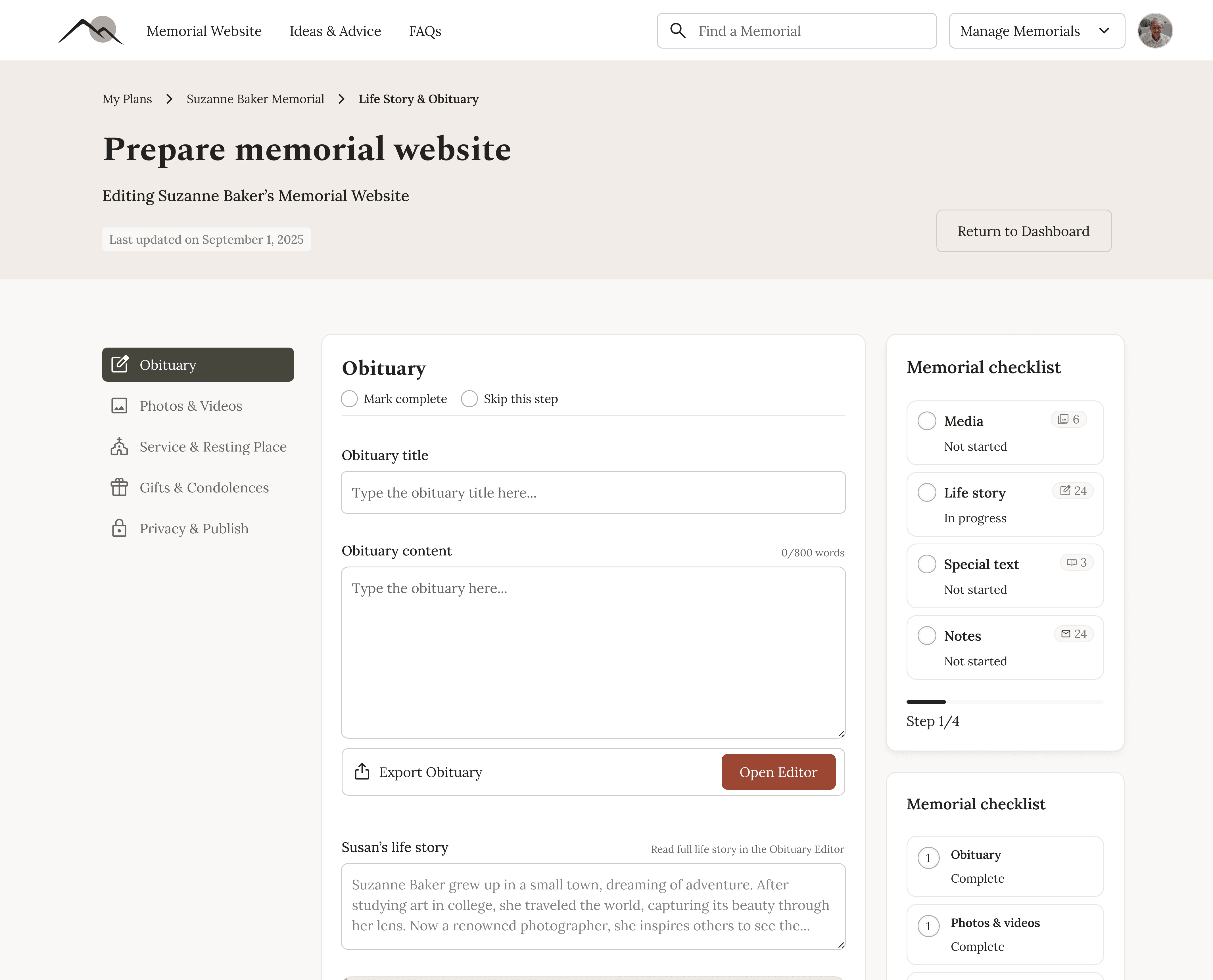
Obituary/Life Story Editor

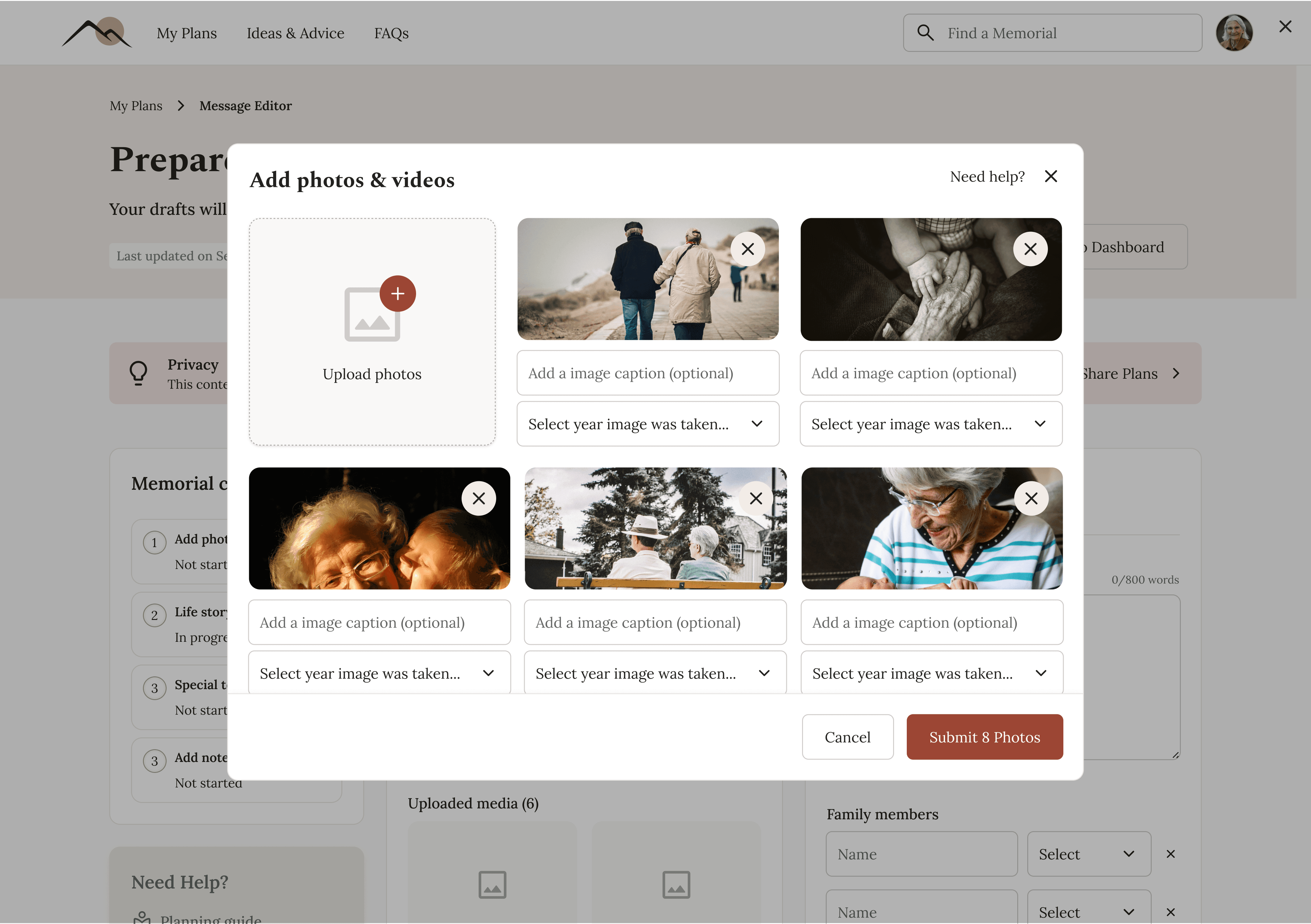
Media Editor
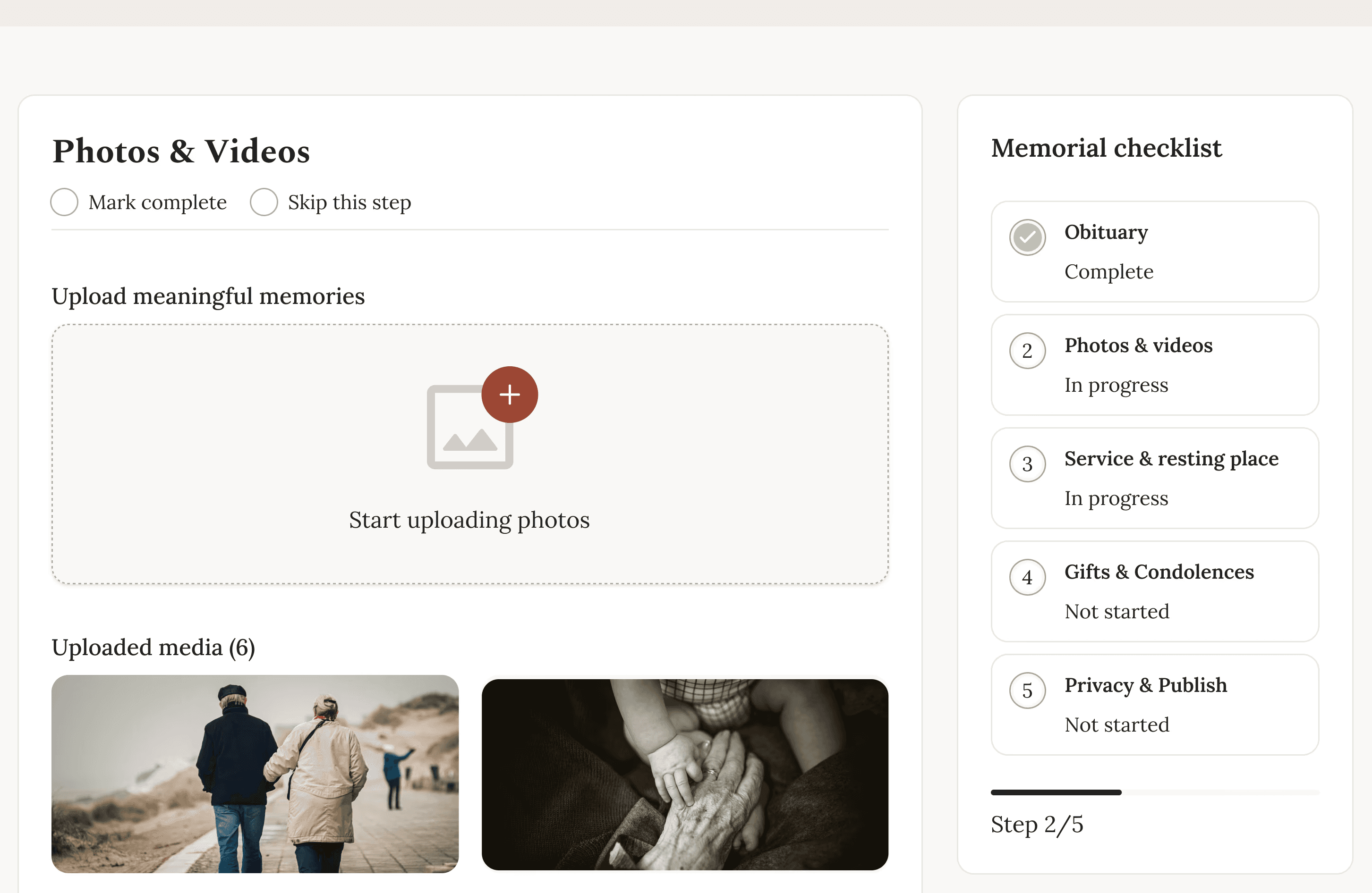
Progress State Example
My approach
I focused on clarity over novelty and structure over surface polish, prioritizing:
Clear mental models
Progressive disclosure
Reusable systems
Strong handoff for no-code development
The core of the work centered on dashboards and editors, where most complexity lived.
The platform had to support private planning, post-loss execution, and a public-facing site - all using the same underlying content.
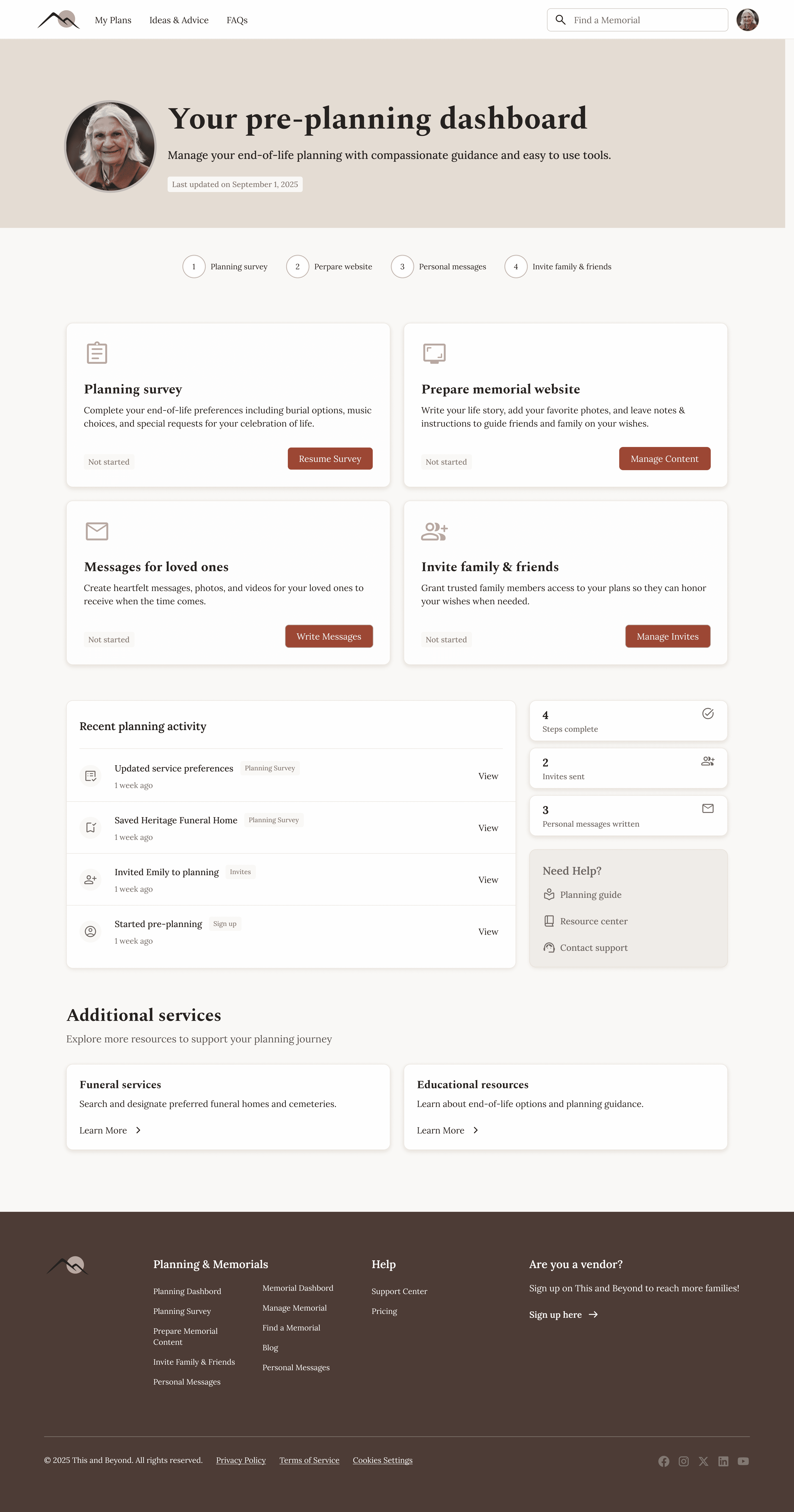


Planner Dashboard (private planning)
Planner User: Personal end of life planning. Once they pass, data is shared with the Mourner User
Mourner Dashboard (post-lost execution)
Mourner User: Is passed all information from loved one to carry out wishes and create Memorial Website
Memorial Website (public-facing site)
Testing and accessibility
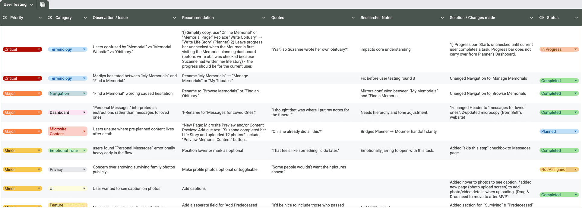
I conducted early usability testing with older adults, including users who regularly read obituaries and memorials online. This helped validate the overall structure while surfacing clarity issues around terminology (e.g., memorial vs. obituary) and expectations for content order.
Design decisions prioritized accessibility and cognitive ease: clear language, large tap targets, high contrast, predictable navigation, and progressive disclosure to avoid overwhelming users during emotionally sensitive tasks. Feedback directly informed refinements to dashboard hierarchy, progress indicators, and the memorial viewing experience.
Design System & Handoff
A lean design system was created to support MVP development:
Core components (buttons, inputs, cards, navigation)
Defined states (hover, disabled, empty, error)
Layout and width guidelines for marketing pages, dashboards, and microsites
Interaction notes tailored for Bubble implementation
All designs were delivered with developer-ready organization and documentation.

What This Project Demonstrates
Designing for emotionally complex, real-world scenarios
Structuring multi-role SaaS platforms
Translating ambiguity into clear, scalable systems
Balancing MVP constraints with long-term product vision
Designing with developers in mind from day one


Next Steps
This case study is actively being refined as the product moves forward. Future iterations will include additional validation, expanded metrics, and deeper UI polish as the platform launches and evolves.